The trends behind Lamp's colour palettes
Feb 8 2022
When we talk about light, we are really talking about colour, because what we know as white light is actually the sum of all the colours from the wavelengths of the whole visible spectrum. However, on this occasion, we are going to be talking about colour trends in lighting, from the chromatic perspective of colour pigment. In essence, what we want to do is delve into the meanings behind each of our new colour palettes. Would you like to join us as we find out more about them?
There is much research on the relationship between people and colour. There is even talk of colour psychology, i.e. how colour influences people’s state of mind and emotions. But it doesn’t end there, as colour has the capacity to influence different areas or situations and, by extension, the sensations associated with them.
This influence of colour has been exploited in architecture, both to support the objectives of the architectural design itself and to trigger certain sensations and feelings in the people who are going to inhabit those architectural areas. A good example of this use of colour in architecture is the Paimio Sanatorium (Finland), designed by Alvar Aalto, who firmly committed himself to architectural humanisation. Together with the artist Eino Kauria, who was in charge of the colour scheme for the interior of the building, certain colours were used in specific areas with the intention of stimulating positive feelings in patients. This project served to illustrate the impact of colour in architecture and how it influenced the well-being and recovery of tuberculosis patients. As a result, the sanatorium became a benchmark for future hospital complexes.
Here at Lamp, we have sought to go a step further in choosing our luminaire’s new colour palettes, and treating them as an element that complements and relates to the architecture.
Colour palette tendencies
In 2021, Lamp committed to launching a series of palettes organised in a range of colours that harmonise, either by contrast, or by the juxtaposition between them. These colours are the expression of several different social macro-trends, which allow the same lighting solution to form part of the message conveyed by the architecture as a response to the users’ diverse needs.
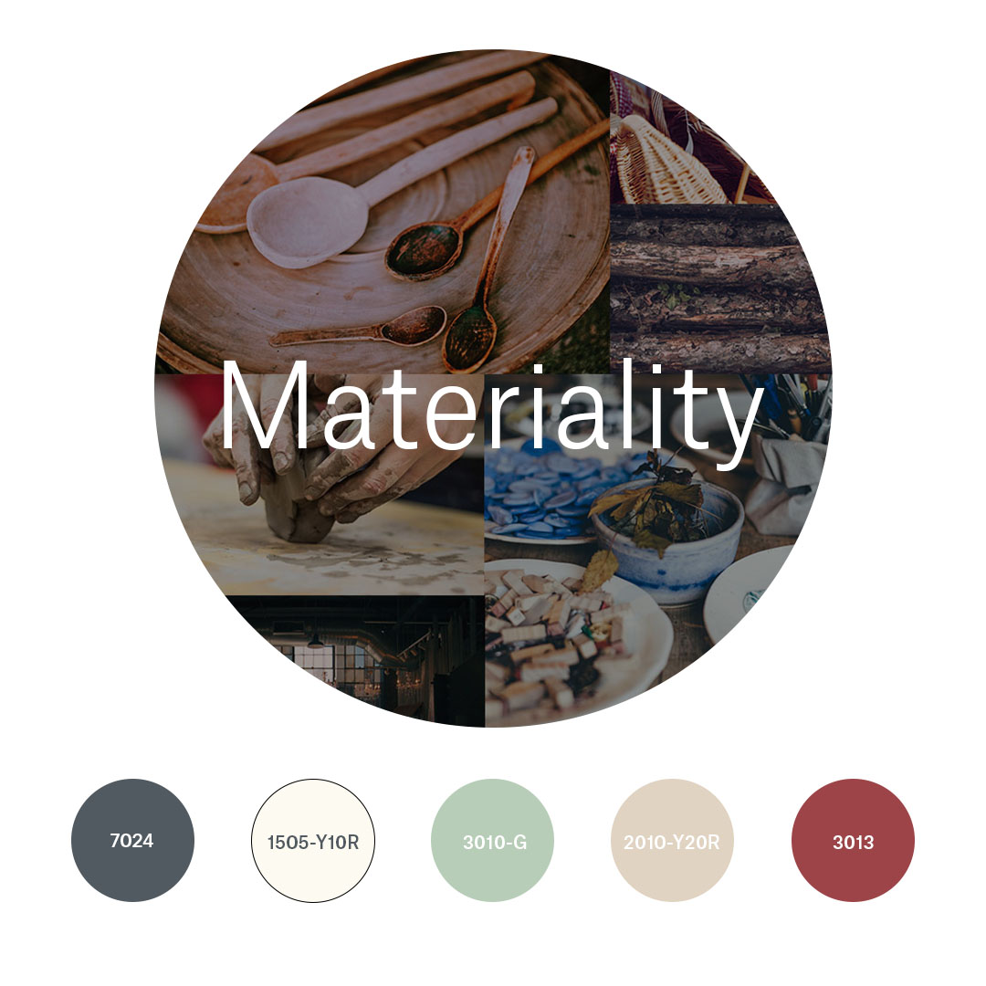
MATERIALITY
This palette highlights the value of living out real experiences, while, at the same time, taking us back to rediscover colours and shades from calmer times gone by, and to experience these spaces with all of our senses, enjoying their materiality. It is a call to greater awareness, and to create spaces that invite us to linger and reflect, while incorporating recycled materials that tell their own story.
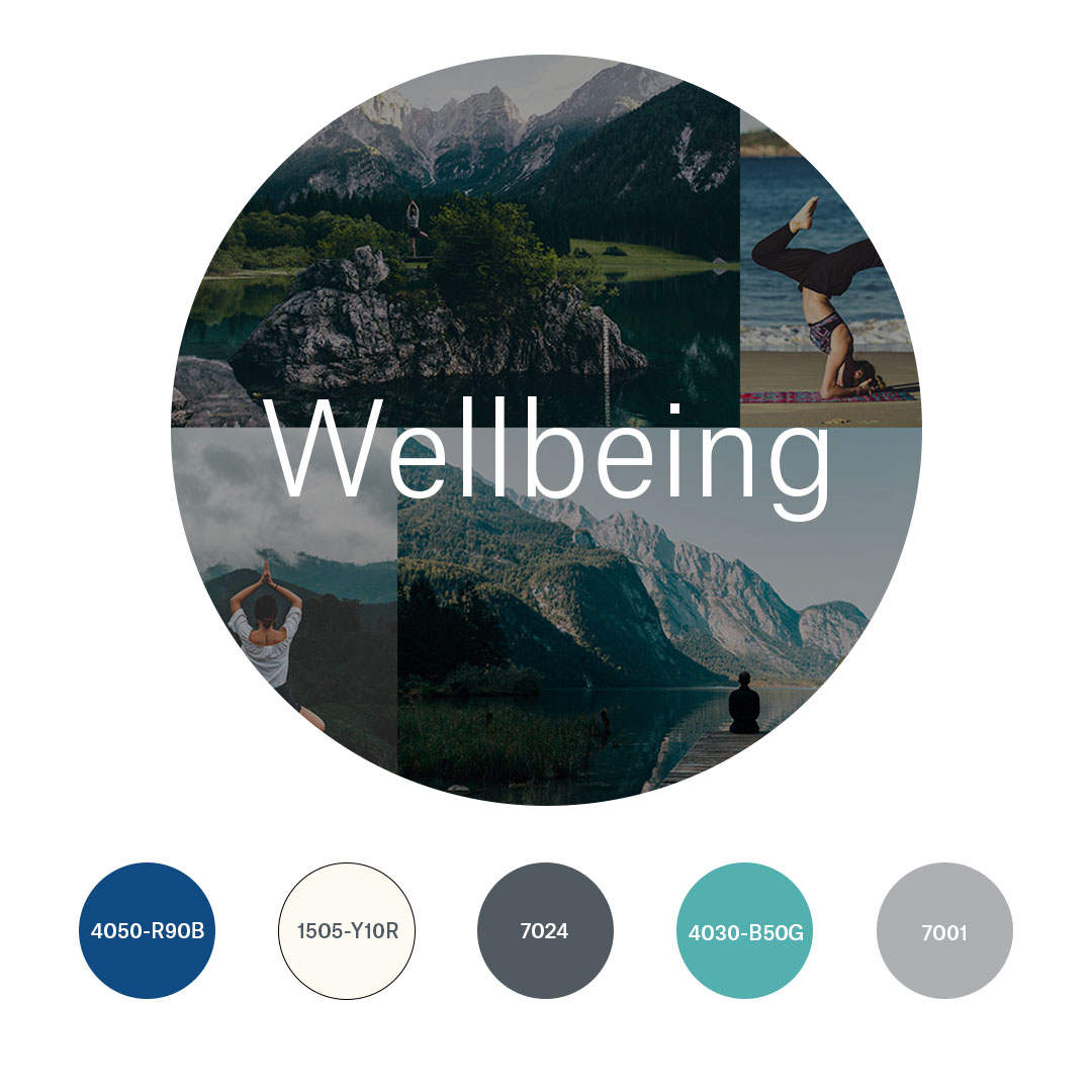
WELLBEING
A harmonised range of five shades, which, when combined together, convey safety, well-being and comfort.
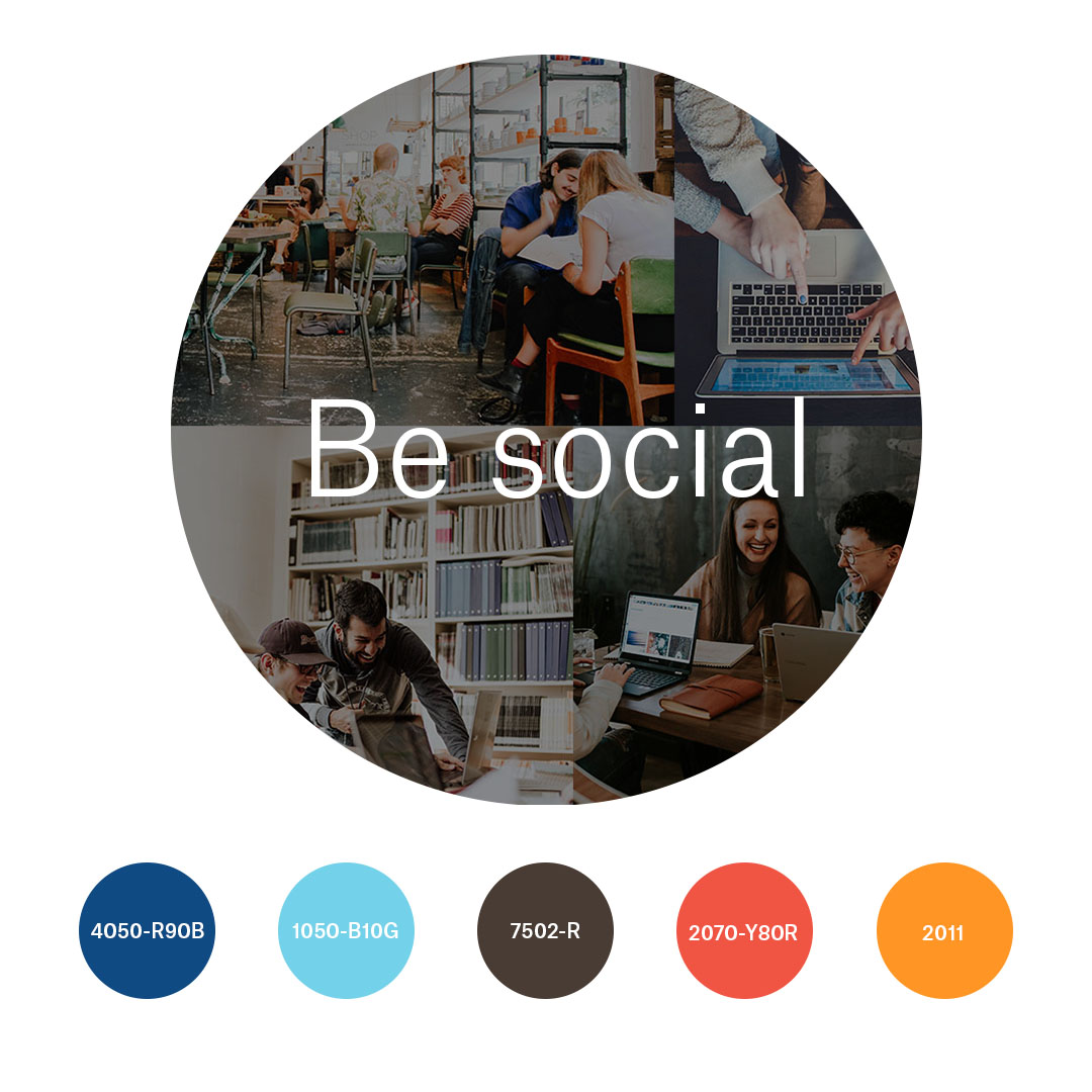
BE SOCIAL
A lively and diverse colour palette. Vibrant colours that invite action, encourage creativity (orange, for example), and keep us alert. They make us more receptive to other people and also to our own ideas.
Other palettes
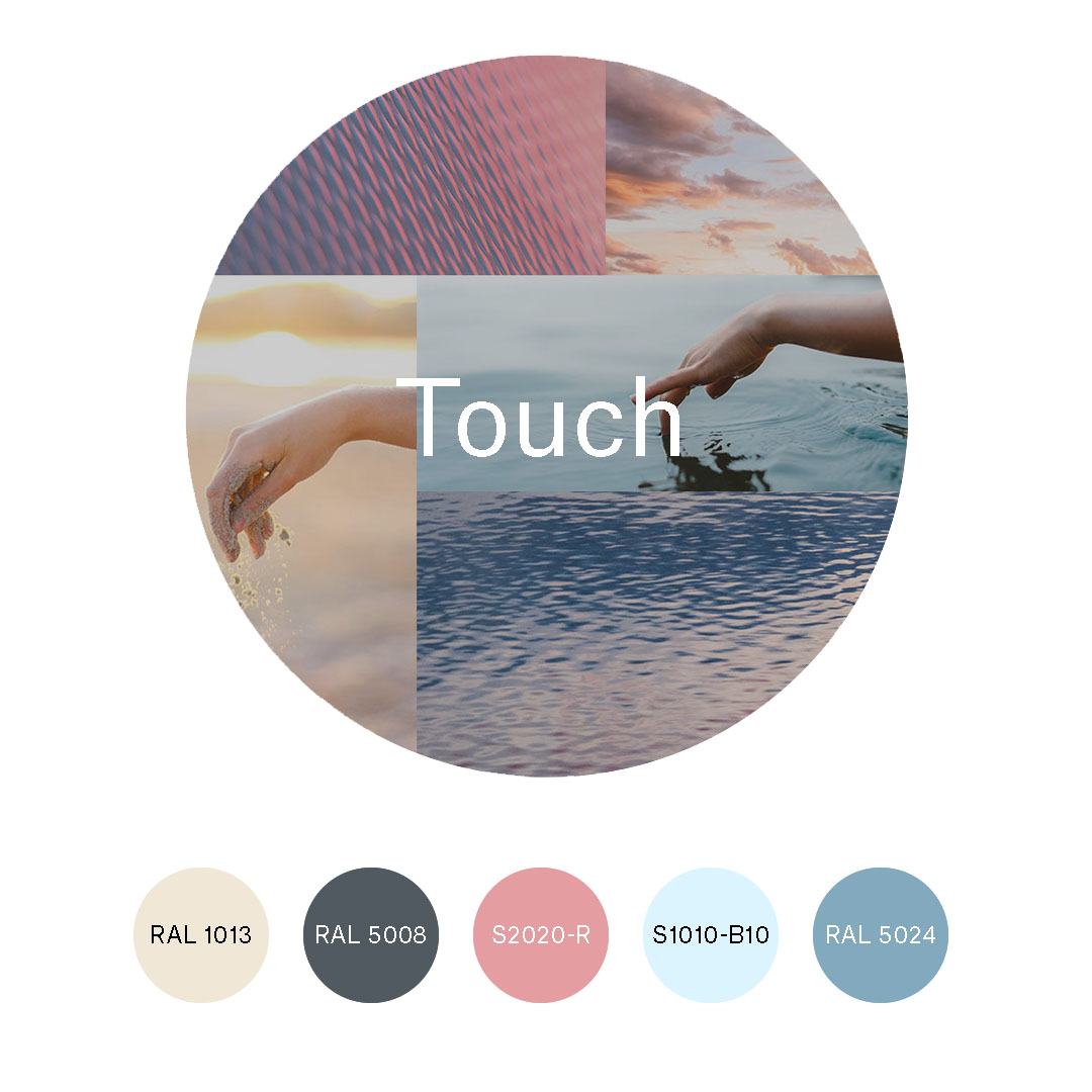
THE POWER OF TOUCH
Emotion and sensitivity are expressed in pastel tones that offer a sense of calm, balance, and order, playing with contrasts in different shades of the cold color palette.
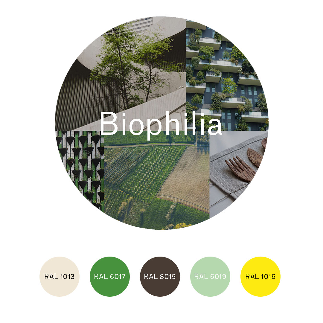
BIOPHILIA
Biophilia is the feeling of being in contact with nature. This colour palette is a call to reconnect with nature through a palette that blends various shades of green, off-white, yellow, and an earthy tone.
Colour palettes in flexible lighting systems
We will now show you some examples of our luminaires that are able to adapt to these new workspaces, along with the colour palette trends that best suit their characteristics:
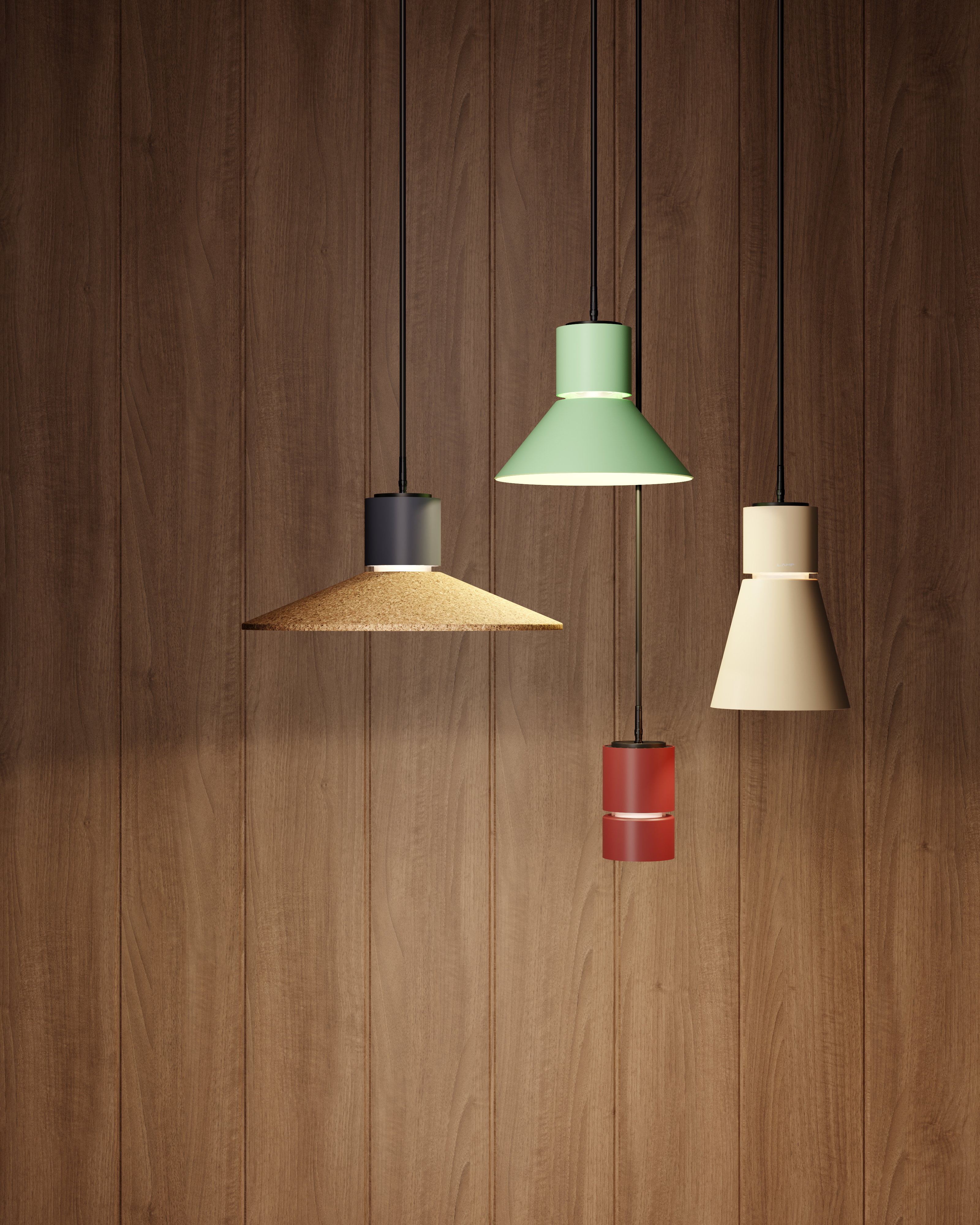
Stormbell 80
This luminaire helps to bring a homely feel to any area. A small shade with high technical specifications, suitable for both the workplace and the hospitality industry, which also incorporates recycled materials.
It leans towards the colour palettes within the concepts of Materiality and Touch, real experiences, and emotion.
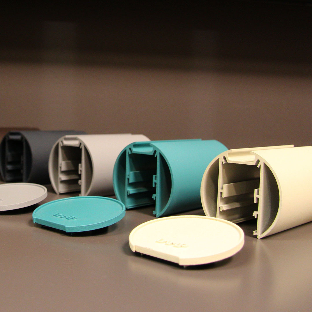
Lamptub 60
A highly adaptable luminaire, in keeping with changing spaces. It encourages creation and helps to personalise spaces.
The trendy colour palettes for this luminaire are those of the Wellbeing and Be Social concepts; well-being, creativity, and collaboration go hand in hand.
Colour to the forefront
Colour’s evocative capacity, and the way it influences us psychologically, are both particularly useful factors when it comes to lighting our society’s ever-changing workspaces. These dynamic spaces require flexible lighting systems in which the colour palette plays an important role in creating harmony with the required atmosphere.
To meet these needs, Lamp offers lighting systems that are not only capable of adapting to these spaces, but also of helping to build them. In a system such as the NOMADIC System, which offers multiple options in itself, the colour palette adds another element of integration and adaptability to the area, transforming it at the same time.